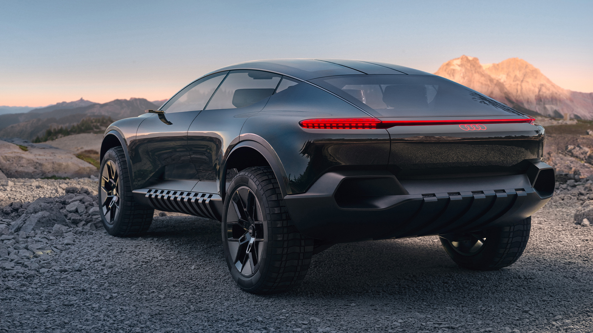
More than a car and more than a one-off, the Audi grandsphere concept* is one of a family of concept vehicles with which Audi is actively shaping premium mobility.
Ms. Sichwardt and Mr. Scharmach, what defines good user interface design?
Bartos Scharmach: The design must be human-centred. In other words, instead of people adapting to the technology, the technology adapts to them. The customers tell the car what they want to do and it then proposes a range of options to meet their wishes.
How does this apply specifically to the Audi grandsphere concept¹?
Bartos Scharmach: Say the users want to relax, then the car must perform all the necessary operations to make that possible. That’s why one thing we did was to dispense with a static menu for the Audi grandsphere concept’s¹ user interface in favour of a context-sensitive one. So if, for instance, the occupants indicate that they want to relax, the car not only offers them the option of watching a movie or listening to relaxing music but also suggests taking a more soothingly scenic route through the countryside.

From the look and feel to functionality and interactive features, the concept car’s interior is planned in advance on the drawing board.
From the look and feel to functionality and interactive features, the concept car’s interior is planned in advance on the drawing board.
“Our role has evolved from shaping a driver-oriented cockpit into designing a space-oriented interior.”
Bartos Scharmach

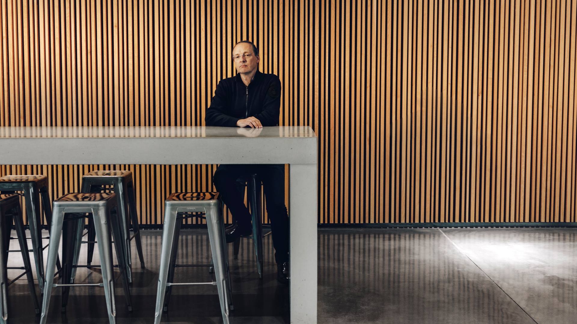
Designer Bartos Scharmach believes technology must always adapt to its users. Not the other way around.

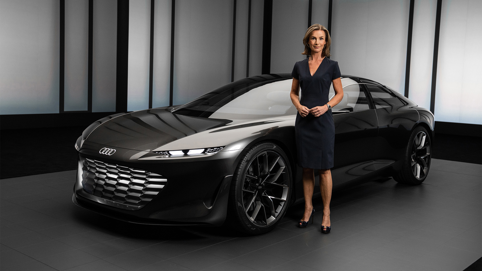
With the Audi grandsphere concept*, Xenia Sichwardt is no longer limited to a single surface, but has the entire interior to play with.
Designer Bartos Scharmach believes technology must always adapt to its users. Not the other way around.
With the Audi grandsphere concept*, Xenia Sichwardt is no longer limited to a single surface, but has the entire interior to play with.
The Audi grandsphere concept* is designed for first-class travel and the ultimate in comfort that goes with that. How does this translate to the user interface?
Xenia Sichwardt: Smartphone manufacturers are always the main frame of reference for user interface (UI) and user experience (UX) design. What sets our UI and UX apart from what you get on a smartphone is that they are not confined to just one surface. Ours unlock new design possibilities in the car’s interior. That’s an incredibly exciting prospect because it means we can merge material choices, architecture and interface design.
Bartos Scharmach: We conceived the Audi grandsphere* for a future that might see self-driving cars* become a reality. As designers, we need to carve out new on-board experiences beyond driving. Our role has evolved from shaping a driver-oriented cockpit into designing a space-oriented interior. Everything in the car – the sides, the headliner, the floor – all command equal attention. To put it in a nutshell: When designing a vehicle like the Audi grandsphere that may one day be capable of autonomous driving, we have the opportunity to increasingly rethink and redesign interiors as living spaces where individuals have the freedom to choose their activities.
So by using projections, you can devote the entire interior to creating occupant experiences?
Bartos Scharmach: The Audi grandsphere² no longer has a traditional dashboard. When you get into the car, you won’t notice any inactive displays – no “dead, black surfaces” as we like to call them. Rectangular displays are very limiting as they dictate to us as designers where to integrate the interfaces. At the same time, they signal to users that here, and only here, is the interface for interaction between man and machine. By projecting information onto the interior architecture surfaces – which, in this case, are made from wood – we can dispense with those screens. We project onto certain parts of the available surface area and, depending on the situation, can enlarge or reduce those areas, which allows us to create a vibrant interior. And when you switch off the projections, there won’t be any blank screens.
Xenia Sichwardt: Frameless design – i.e. interfaces that aren’t contained within set dimensions or tied to a specific position – was very important to us. Without those restrictions, you are free to display information wherever you like or, more importantly, wherever users want it. And that’s the prime directive for first-class travel in this context – meeting occupants’ needs.
How do you incorporate physical materials into a user interface?
Xenia Sichwardt: We started by asking ourselves what it would be like to eliminate all displays from the vehicle and instead work with as many natural materials as possible, such as wood. No two pieces of wood are the same, which is why they inevitably create something unique. As a UI designer, it’s also very exciting exploring this new kind of depiction: What actually happens when we combine projections and natural materials? What kind of interface does that create? Given that everyone is familiar with screens as glass surfaces, switching to projections on wood breaks new ground. Ultimately, it’s worth remembering that humans have an affinity for natural materials because being surrounded by nature puts us at ease.
“Frameless design – i.e. interfaces that aren’t contained within set dimensions or tied to a specific position – was very important to us in the Audi grandsphere concept*.”
Xenia Sichwardt

Natural materials, such as wood, imbue the vehicle interior with a cosy, soothing atmosphere.

One of the questions the designers had to ask themselves was how projections look on wood.
Natural materials, such as wood, imbue the vehicle interior with a cosy, soothing atmosphere.
One of the questions the designers had to ask themselves was how projections look on wood.
There is that rotary dial in the doors. What does that do?
Bartos Scharmach: The rotary ring and buttons form an innovative control element with which the driver can navigate various function menus by touch when the car is driven manually. When automated mode* is engaged and the car takes over the driving, passengers can recline their seats into a very comfortable position, potentially putting the controls in the doors out of reach. Our solution is the MMI touchless response, which relies on a combination of eye tracking and gesture control. Once the occupant establishes eye contact, they can perform the same hand motion as if they were turning the dial with their fingers. The user is not actually touching anything, but they can see that the rotary dial is nevertheless moving in response to their gesture.

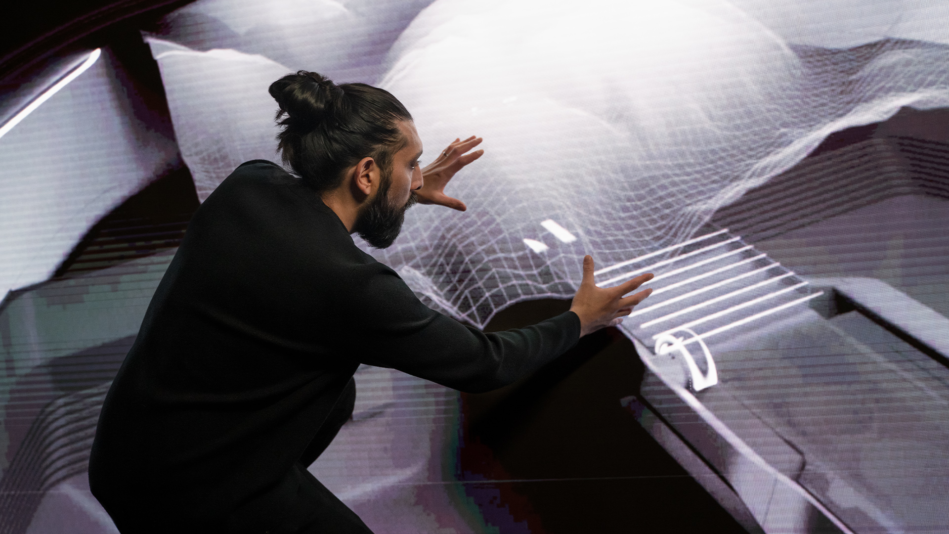
Even in the reclined position, Bartos Scharmach can easily operate the MMI touchless response using eye contact and gestures.
Even in the reclined position, Bartos Scharmach can easily operate the MMI touchless response using eye contact and gestures.
There’s no mistaking the Four Rings’ distinctive exterior design idiom. What makes Audi user interface design special?
Xenia Sichwardt: We draw inspiration from other cultures. For this project, we borrowed primarily from traditional Japanese painting and its design principle, which states that “the empty space embraces the image”. Turning our approach to design on its head in this way proved very inspiring. Rather than overload the display area with information, we pared things down to the bare necessities and gave it lots of breathing space, which in turn accentuates the meaning of the message. At Audi, we always strive for a simplicity that is, by its very nature, elegant. Or as German industrial designer Dieter Rams once put it, “Less but better.”


